

Welcome to practical projects on Power BI for hands-on experience and learning.
Table of Content
A Comprehensive Introduction to Power BI Dashboards with a project for beginners.
Creating a Power BI dashboard is about making a visual representation of your data for meaningful insights. Here’s a simple guide on how to do it:
Step 1: Load Your Data
- Open Power BI Desktop.
- Use the “Get Data” option to load your dataset.
Step 2: Clean and Transform Data
- In the Query Editor, clean and transform your data.
- Ensure correct data types for each column.
- Handle missing values and outliers appropriately.
Step 3: Establish Relationships
- Identify and set up relationships between tables using common columns.
- Manage relationships in the “Model” view.
Step 4: Define Key Measures
- Create key measures for analysis, like average salary or total salaries.
- Write DAX formulas for these measures.
Step 5: Design Visualizations
- Go to the “Report” view.
- Drag and drop visuals onto the canvas, like tables, charts, and maps.
- Use slicers for easy data filtering.
- Create trend lines, bar charts, and pie charts to represent salary distribution, job roles, and other relevant metrics.
- Use cards to display key measures.
Step 6: Design Dashboard Layout
- Go to the “Dashboard” view.
- Organize visuals into a visually appealing layout.
- Add text boxes or images for additional context.
Step 7: Implement Interactivity
- Add interactivity with features like drillthrough, bookmarks, and tooltips.
- Manage visibility using the “Selection Pane” based on user interactions.
Step 8: Test and Refine
- Test the dashboard to ensure interactions and filters work correctly.
- Refine visuals, layout, and measures based on feedback.
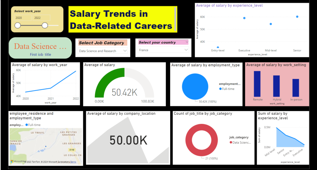
Monitoring Pay Trends in Data-Related Careers: An Extensive Look at Power BI
I’d want to hear your thoughts and suggestions as the person who created this Power BI dashboard. Your insightful recommendations will help us improve and refine our tool so that it better meets the needs of the market. Achieving excellence is a continuous process, and your feedback is crucial to making this dashboard a useful tool for both companies and professionals.
Data used for creating a dashboard related to salary trends in data
Download the dataset using the download button.
Here are some questions that you can use as a starting point for creating a Power BI dashboard based on the dataset you’ve described:
- Salary Trends:
- What is the overall trend in average salaries over the years?How do salaries vary across different job categories?In which countries do data professionals earn the highest/lowest salaries?
- Job Roles and Categories:
- What are the most common job titles in the dataset?
- How are job roles distributed across different job categories?
- What is the salary distribution for specific job titles?
- Currency Comparison:
- How does the distribution of salaries change when converted to USD?
- Which currencies show the highest and lowest average salaries?
- Geographical Analysis:
- How does the location of the employee impact salary levels?
- What are the salary differences between different company locations?
- How does the cost of living in the employee’s country of residence relate to salary?
- Experience and Salary:
- How does professional experience level correlate with salary?
- Are there significant differences in salary levels based on experience for specific job categories?
- Employment Type and Salary:
- What is the average salary for different employment types?
- How does the salary structure vary between full-time, part-time, and contract roles?
- Work Setting Impact:
- How does the work setting (remote, in-person, hybrid) affect salary levels?
- Are there notable differences in salaries between different work settings?
- Company Factors:
- How does the size of the employer company influence salary?
- Are there specific job categories where salary is significantly influenced by company size?
- Interactive Elements:
- How does selecting a specific year or job category impact the overall dashboard?
- What happens when you filter by both job category and work setting simultaneously?
- Trend Analysis:
- Can you identify any notable trends or patterns in salary distribution over the years?
- Are there specific job categories experiencing significant growth or decline in salaries?
Below is the link to access the sample dashboard.
To utilize the dashboard, follow these steps:
- Download the file.
- Right-click on the downloaded file and open it using “Power BI Desktop.”
Dashboard link:- Jobs in data
FAQ
1. What is DAX, and why is it essential in Power BI?
Data Analysis Expressions (DAX) is a formula language used in Power BI for creating custom calculations and aggregations in data models. It is essential for defining key measures, such as averages, totals, and ratios, which form the basis of insightful analyses.